Two regression based methods for interrupted time series
Background
Interrupted time series (ITS) analysis is a powerful quasi-experimental study design for evaluating the effectiveness of population-level health interventions that have been implemented at a clearly defined point in time. We have conducted and published an exploration of the effectiveness of PCV vaccines in Hong Kong using this method.
The core of ITS analysis is the segmented regression model. Some people may argue that this regression-based method is not perfect because it lacks the ability to account for autocorrelation and seasonality. We are not going to discuss this in this article. In the current article, I want to discuss the issue in the widely adopted two regression-based methods.
Updated: The author has updated and made corrections to these methods at the time of writing.
Two approaches are widely adopted by JLB 2017 and AKD 2002.
The core of ITS analysis is the segmented regression model, which can be expressed in two slightly different formulations based on the JLB 2017 and AKD 2002 papers:
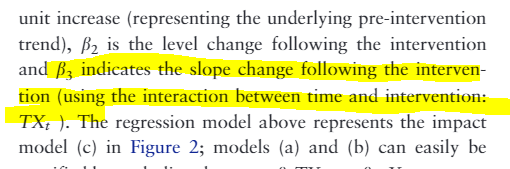
JLB 2017 interactive formulation: \(Y_t = \beta_{0} + \beta_{1} \cdot time_t + \beta_{2} \cdot intervention_t + \beta_{3} \cdot time \cdot intervention_t\)
where
- $Y_t$ is the outcome variable at time $t$
- $time_t$ is the time since the start of the study
- $intervention_t$ is a dummy variable indicating the pre- or post-intervention period
- $(time_t - time_of_intervention) \cdot intervention_t$ is the interaction term representing the change in slope after the intervention
The interpretation of parameters in the original paper
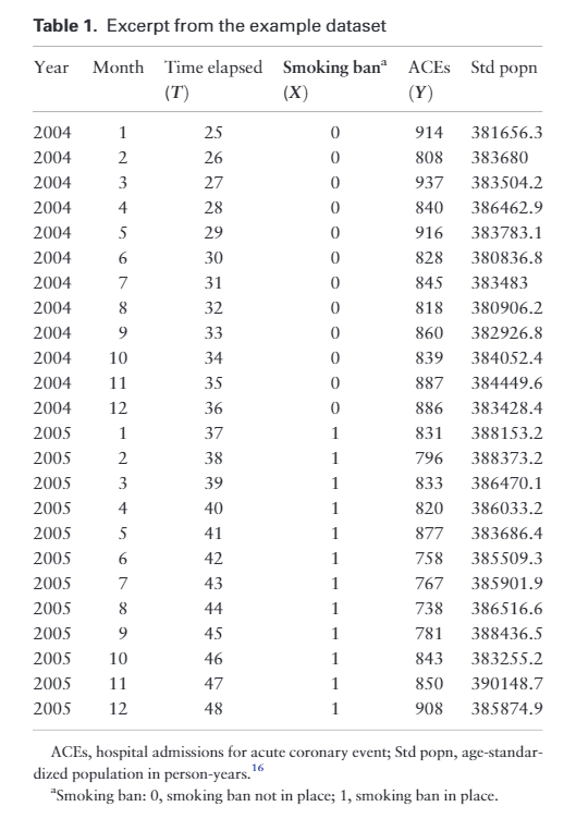
and the dataset looked like:
while the formula in the AKD’s additional model:
\[Y_t = \beta_{0} + \beta_{1} \cdot Time_t + \beta_{2} \cdot Intervention_t + \beta_{3} \cdot NewTimeAfterIntervention_t\]- Where the terms are similar, but the interaction term $(time_t - time_of_intervention) \cdot intervention_t$ is replaced with $time_after_intervention_t$.
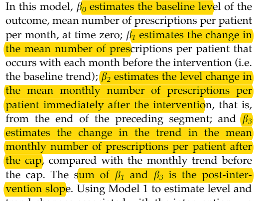
And the interpretation of parameters in original article
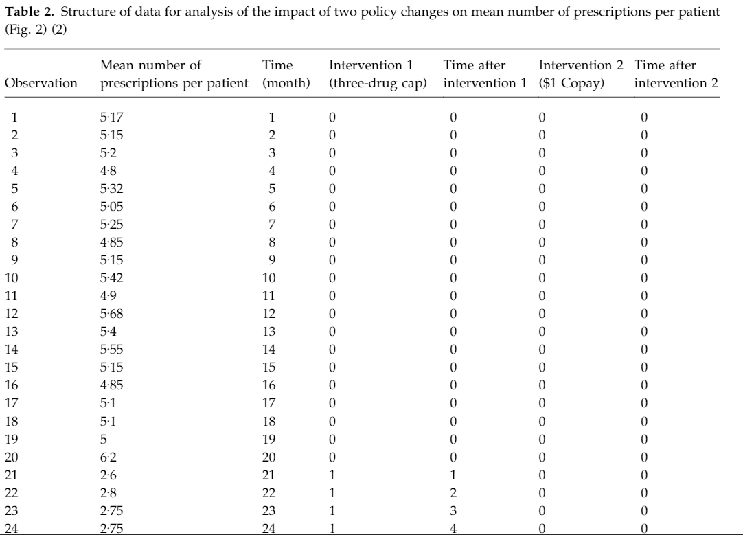
and the dataset looks like:
The textbook for ITS is the JLB’s tutorial 《Interrupted time series regression for the evaluation of public health interventions: a tutorial》. When I dug deeper, I found the ultimate reference was the AKD article from 2002 《Segmented regression analysis of interrupted time series studies in medication use research》. However, the formulas used in these two papers have a slight difference.
The difference between two models
Generate a dataset
library('ggplot2')
set.seed(999)
testdf <- data.frame(outcome = ceiling(runif(100,1,100)),Time = 1:100, PCV = c(rep(0,70),rep(1,30)),NewTime = c(rep(0,70),1:30))
testdf
##     outcome Time PCV NewTime
## 1        40    1   0       0
## 2        59    2   0       0
## 3        11    3   0       0
## 4        86    4   0       0
## 5        79    5   0       0
## 6        13    6   0       0
## 7        62    7   0       0
## 8        10    8   0       0

## 95       52   95   1      25
## 96       18   96   1      26
## 97       73   97   1      27
## 98       51   98   1      28
## 99       50   99   1      29
## 100      90  100   1      30
Model with interaction term
test1 <- glm(data=testdf,outcome~Time+PCV+Time*PCV)
coef(test1)
## (Intercept)        Time         PCV    Time:PCV
##  44.3055901   0.2264019 -69.8521232   0.5827194
Model with additional term
test2 <- glm(data=testdf,outcome~Time+PCV+NewTime)
coef(test2)
## (Intercept)        Time         PCV     NewTime
##  44.3055901   0.2264019 -29.0617683   0.5827194
The two papers, JLB 2017 and AKD 2002, both highlight that the key parameter of interest is the change in slope after the intervention. However, the specific formulations and the resulting numerical estimates for this slope change parameter are quite different between the two papers.
This discrepancy in the slope change estimates is puzzling to me. One possibility is that one of the formulations may be incorrect or inappropriate. Alternatively, as I mentioned, we may need to consider some adjustments to the models, as Dr. Qiu suggested in the WeChat group discussion.
Another observation I make is that even when using the “slope-only” model as outlined in the JLB 2017 method, I often observe a significant level change parameter ($\beta_2$). This seems counterintuitive to me, as the slope-only model is intended to capture only the change in slope, not the level.
Given these concerns, I am hesitant to outright state that the JLB 2017 method is wrong. However, I believe that the JLB 2017 formulation may not be the most appropriate for a pure slope-only model. I suggest we should be cautious in interpreting the level change parameter ($\beta_2$) from this method, as it may not be meaningful or reliable in the context of a slope-only intervention analysis.
Overall, my perspective is that the differences in the slope change estimates between the two papers, as well as the potential issues with interpreting the level change parameter in the JLB 2017 method, warrant further investigation and careful consideration before drawing conclusions about the intervention effect.
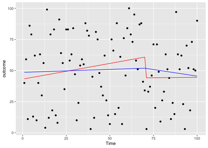
Slope-only model in two method
test3 <- glm(data=testdf,outcome~Time+Time:PCV)
coef(test3)
## (Intercept)        Time    Time:PCV
##  43.0861172   0.2523481  -0.2378050
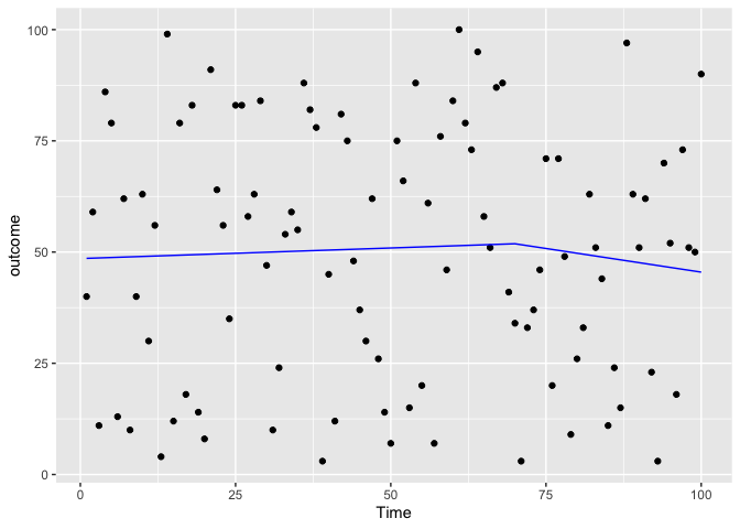
test4 <- glm(data=testdf,outcome~Time+NewTime)
coef(test4)
## (Intercept)        Time     NewTime
##  48.5384253   0.0475497  -0.2601473
predicted_df <- data.frame(outcome_pred = predict(test3,testdf),Time=testdf$Time)
predicted_df2 <- data.frame(outcome_pred = predict(test4,testdf),Time=testdf$Time,NewTime=testdf$NewTime)
ggplot(data = testdf, aes(x = Time, y = outcome)) +
    geom_point(color='black') +
    geom_line(color='red',data = predicted_df, aes(x=Time, y=outcome_pred))+
    geom_line(color='blue',data = predicted_df2,aes(x=Time,y=outcome_pred))
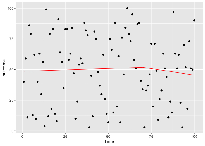
Fixed the previous problem by changing the time
test5 <- glm(data=testdf,outcome~Time+NewTime:PCV)
coef(test5)
## (Intercept)        Time NewTime:PCV
##  48.5384253   0.0475497  -0.2601473
predicted_df3 <- data.frame(outcome_pred = predict(test5,testdf),Time=testdf$Time,NewTime = testdf$NewTime)

ggplot(data = testdf, aes(x = Time, y = outcome)) +
    geom_point(color='black') +
    geom_line(color='red',data = predicted_df3, aes(x=Time, y=outcome_pred))
ggplot(data = testdf, aes(x = Time, y = outcome)) +
    geom_point(color='black') +
    geom_line(color='blue',data = predicted_df2,aes(x=Time,y=outcome_pred))
Apply to our dataset
df <- read.csv('stdpm.csv')
df$NewTime <- c(rep(0,69),1:(166-69))
df
##       X year month pneu_ad  stdpop time pcv pcv.lag1 pcv.lag3 pcv.lag6 pcv.lag9
## 1     1 2004     1    1562 5514526    1   0        0        0        0        0
## 2     2 2004     2    2272 5564488    2   0        0        0        0        0
## 3     3 2004     3    2343 5609644    3   0        0        0        0        0
## 4     4 2004     4    2569 5568791    4   0        0        0        0        0
## 5     5 2004     5    2500 5585966    5   0        0        0        0        0
## 6     6 2004     6    2626 5559820    6   0        0        0        0        0

## 163 163 2017     7    4840 9013479  163   1        1        1        1        1
## 164 164 2017     8    3913 9070214  164   1        1        1        1        1
## 165 165 2017     9    3602 8957569  165   1        1        1        1        1
## 166 166 2017    10    3650 9032499  166   1        1        1        1        1
##         rate      lag NewTime
## 1   2.832519       NA       0
## 2   4.083035 7.353722       0
## 3   4.176736 7.728416       0
## 4   4.613210 7.759187       0
## 5   4.475501 7.851272       0
## 6   4.723174 7.824046       0

## 163 5.369736 8.396155      94
## 164 4.314121 8.484670      95
## 165 4.021180 8.272060      96
## 166 4.040964 8.189245      97
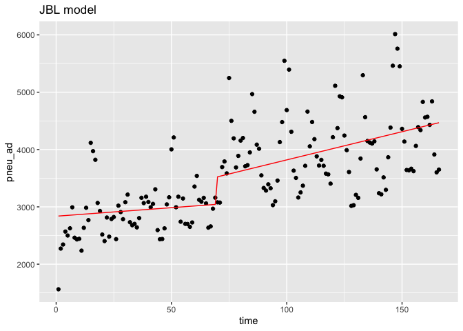
Interaction.model <- glm(data=df,pneu_ad~time+time:pcv)
coef(Interaction.model)
## (Intercept)        time    time:pcv
## 2836.755182    2.976605    6.849634
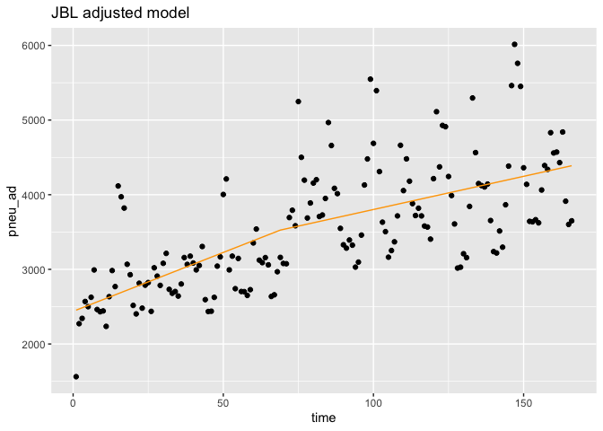
Interaction.model.adj <- glm(data=df,pneu_ad~time+NewTime:pcv)
coef(Interaction.model.adj)
## (Intercept)        time NewTime:pcv
## 2437.493871   15.776112   -6.887371
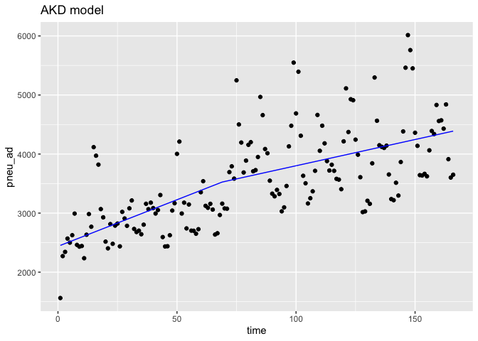
Additional.model <- glm(data=df,pneu_ad~time+NewTime)
coef(Additional.model)
## (Intercept)        time     NewTime
## 2437.493871   15.776112   -6.887371
predicted_df.in <- data.frame(outcome_pred = predict(Interaction.model,df),Time=df$time)

predicted_df.in.adj <- data.frame(outcome_pred = predict(Interaction.model.adj,df),Time=df$time)

predicted_df.ad <- data.frame(outcome_pred = predict(Additional.model,df),Time=df$time,NewTime=df$NewTime)


ggplot(data = df,aes(x = time, y = pneu_ad)) +
    geom_point(color='black') +
    geom_line(color='red',data = predicted_df.in, aes(x=Time, y=outcome_pred))+
    ggtitle('JBL model')
ggplot(data = df,aes(x = time, y = pneu_ad)) +
    geom_point(color='black') +
    geom_line(color='orange',data = predicted_df.in.adj, aes(x=Time, y=outcome_pred))+
    ggtitle('JBL adjusted model')
ggplot(data = df,aes(x = time, y = pneu_ad)) +
    geom_point(color='black') +
    geom_line(color='blue',data = predicted_df.ad,aes(x=Time,y=outcome_pred))+
    ggtitle('AKD model')
Limitation
Poisson regression should be used for count data rather than linear regression. I have not added offset and deseasonalized terms in the model.
### 4.3 Model with additional term
testtesttest <- lm(data=testdf[testdf$PCV==0,],outcome~Time)
coef(testtesttest)
## (Intercept)        Time
##  44.3055901   0.2264019
testtesttest <- lm(data=testdf[testdf$PCV==1,],outcome~Time)
coef(testtesttest)
## (Intercept)        Time
## -25.5465332   0.8091212
Enjoy Reading This Article?
Here are some more articles you might like to read next: